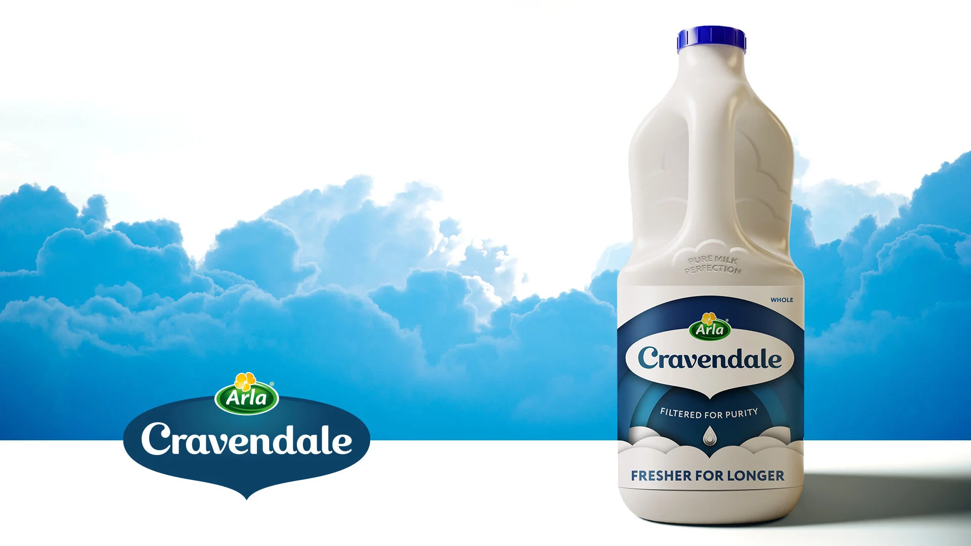
Cravendale. A drop of filtered heaven.
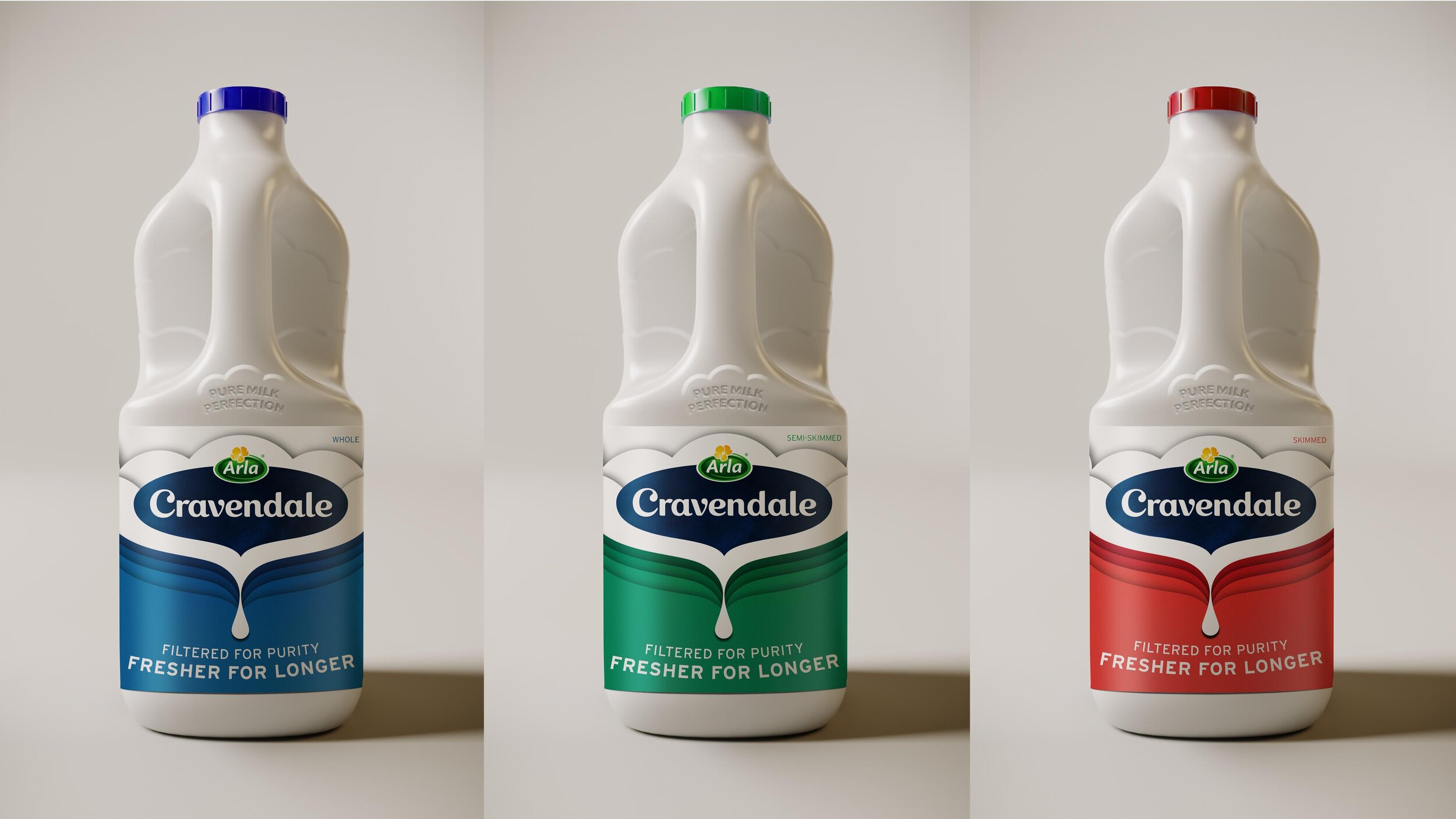
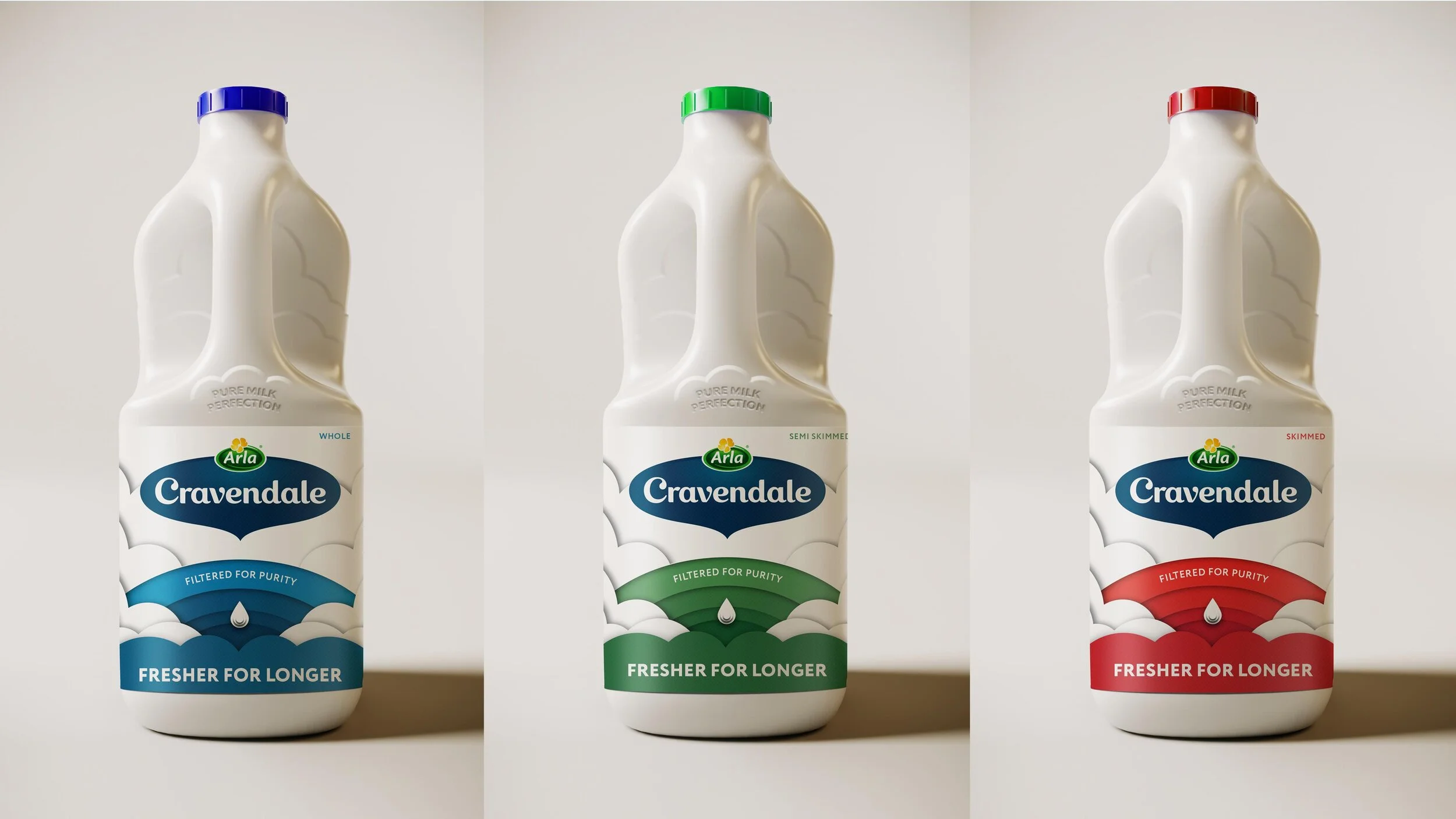
The UK’s milk love-brand, Cravendale started a brand review in 2020 to reinforce its positioning of purity and to communicate its filtration process.
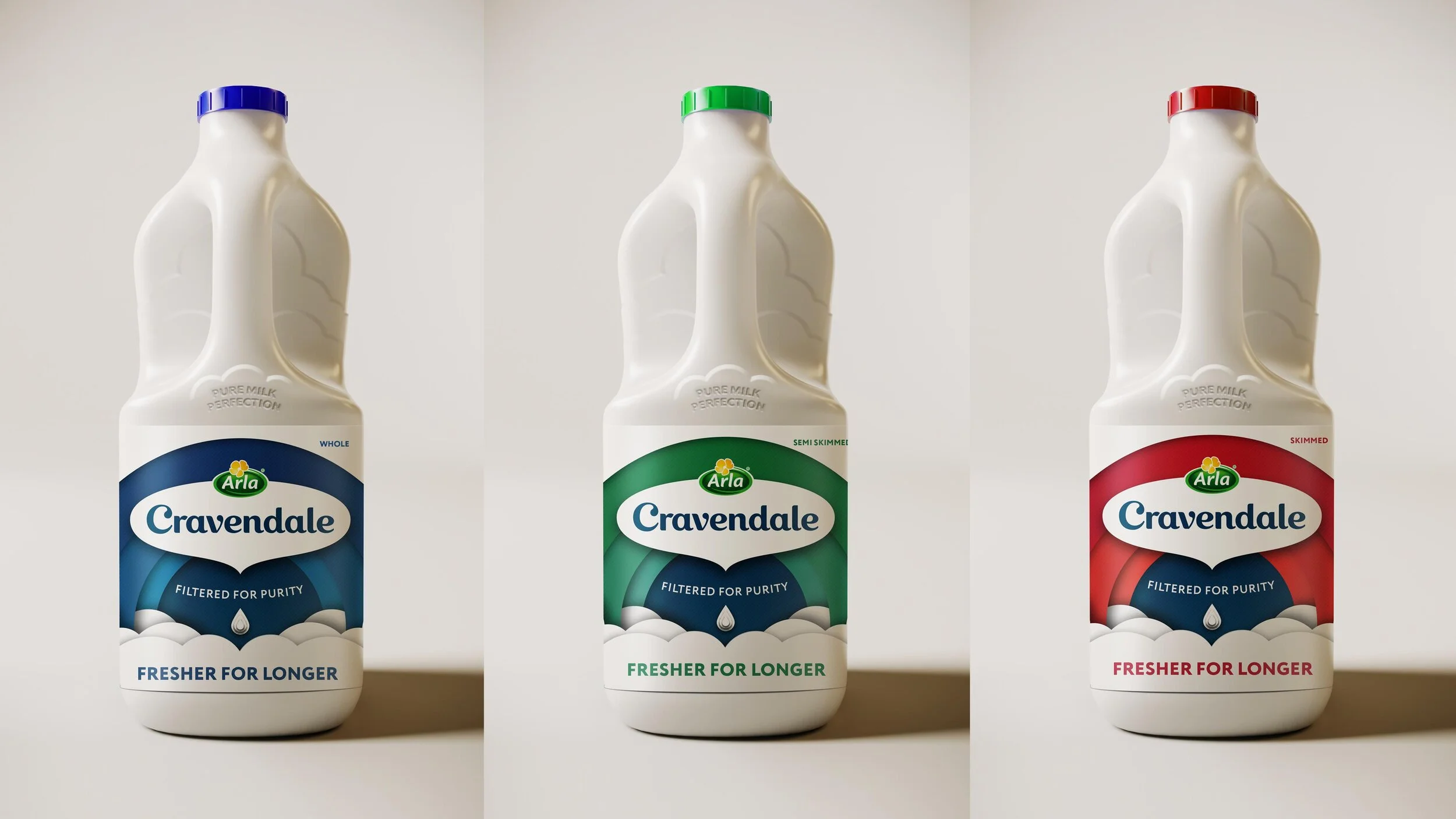
Usually found in the trolleys and fridges of consumers considered perfection seekers, the process started by dissecting and reviewing the brand assets like the logo, colours and clouds to elevate the brand while keeping its playful personality.
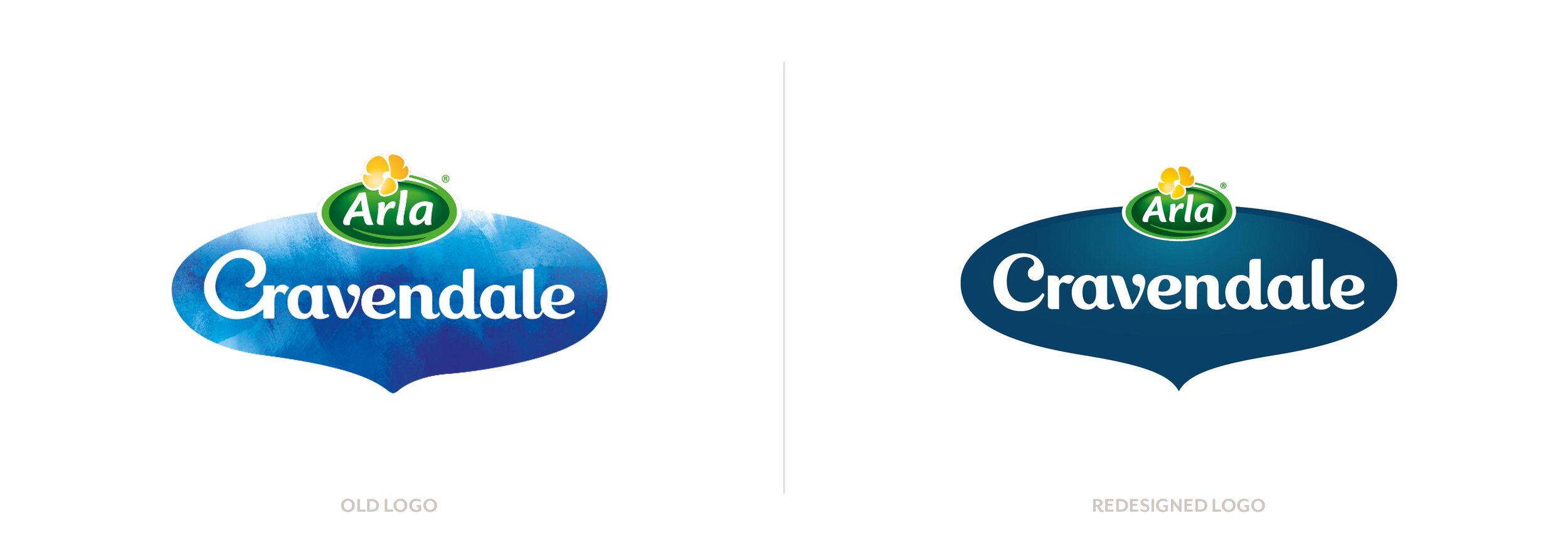
We worked with Rob Clarke to bring the logo back to life in a way much more aligned to the concept of filtered perfection.
Elevating the in-hand experience.
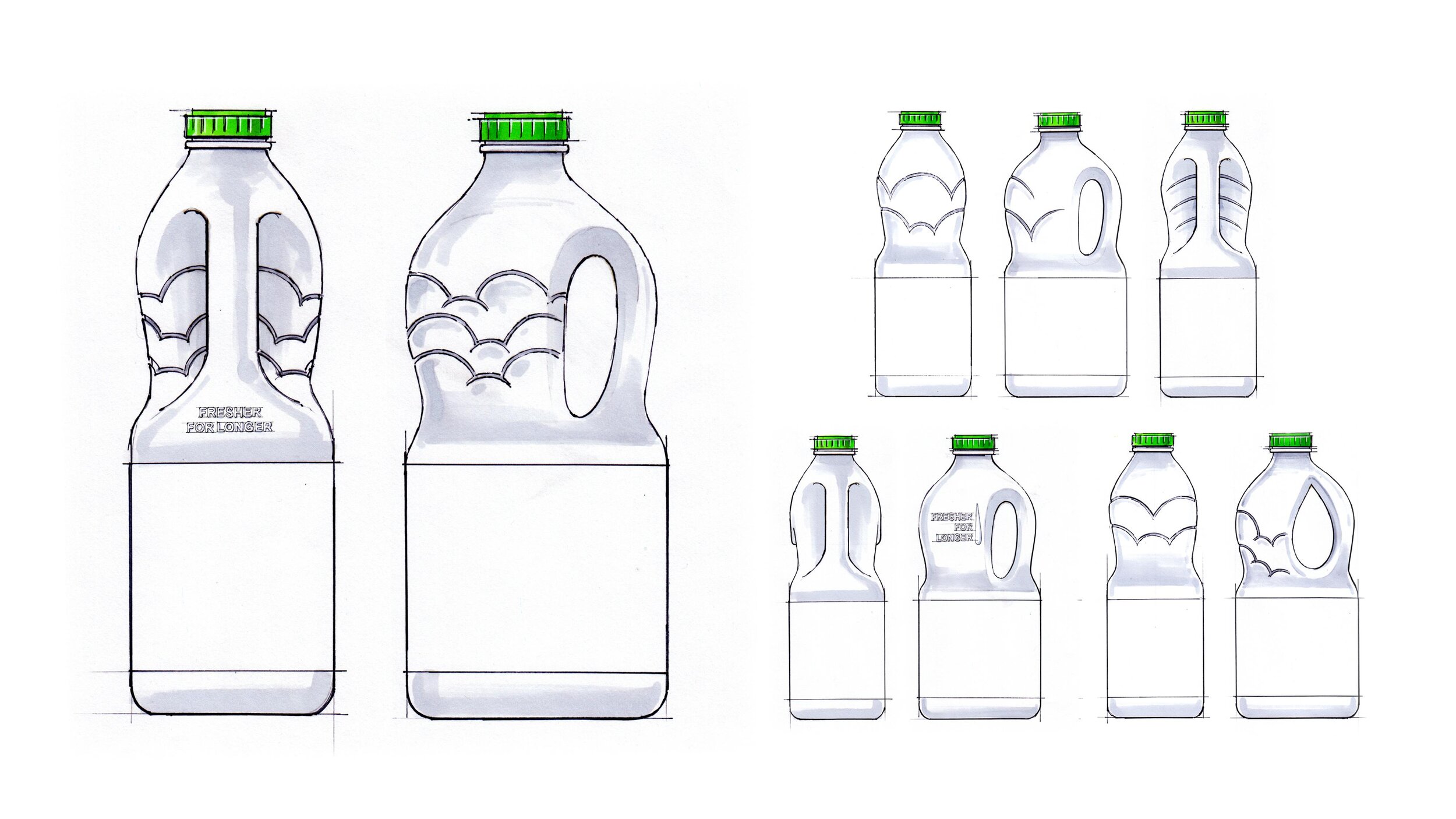
Redesigning the packaging wasn’t just about making the label work better. We also elevated the in-hand experience by adding embossing elements to the bottle to increase the feeling of heavenly milk, filtered through clouds.
The disciplines
Product positioning
Creative strategy & direction
Client relationship leadership role
Brand / Packaging / Guidelines / Retail / Advertising